Garamond, Gyve, &c.
gG
WHAT: G
WHEN: 1996
WHO: The Un-Gyve Limited Group
WHERE: Boston
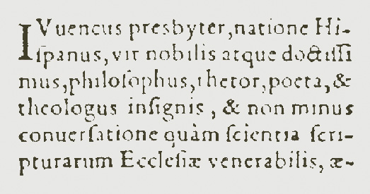
GARAMOND: Claude Garamond (c. 1480, Paris - 1561, Paris) publisher, punchcutter, and type founder, typographer, apprenticed as a punchcutter with Simon de Colines in Paris, 1510, and later trained with Geoffroy Tory. Among the most influential type designers of his time, Garamond is credited with the introduction of the accent, apostrophe and cedilla into the French language. Garamond’s first type, based on Aldus Manutius’ type De Aetna, cut in 1455, debuts in a 1530 edition of Erasmus's Paraphrasis in Elegantiarum Libros Laurentii Vallae. By commission of King Francis I in 1540 Garamond gave Grec du Roi in three sizes to Parisian scholar and printer Robert Estienne for a book series; the Greek typefaces, informed by Geoffroy Tory's interest in humanist typography and majuscules (ancient Greek capital letterforms) and inspired by the handwriting of Angelo Vergecio, the King's Librarian at Fontainebleau, and the hand of Henri Estienne, the typographer's ten-year-old pupil. Garamond enters into publishing in 1545, initially working with Pierre Gaultier and later with Jean Barbe. His first publishing project is Pia et Religiosa Meditatio by David Chambellan. The books are set in Garamond typefaces. Upon his death, Christoph Plantin from Antwerp, the Le Bé type foundry and the Frankfurt foundry Egenolff-Bermer acquire a large proportion of Garamond’s original punches and matrices. The typefaces produced by Garamond between 1530 and 1545 are considered the typographical highlight of the 16th century; recognized for their elegance, readability, fluidity of form and consistency of character.
GARAMOND: Old-style serif typefaces designed after the work of 16th Century punchcutter Claude Garamond; recognized for their elegance, readability, fluidity of form and consistency of character. One of the four typefaces favored by Massimo Vignelli in The Vignelli Canon:
"The advent of the computer generated the phenomena called desktop publishing. This enabled anyone who could type the freedom of using any available typeface and do any kind of distortion. It was a disaster of mega proportions. A cultural pollution of incomparable dimension. As I said, at the time, if all people doing desktop publishing were doctors we would all be dead! Typefaces experienced an incredible explosion. The computer allowed anybody to design new typefaces and that became one of the biggest visual pollution of all times.
In order to draw attention to that issue I made an exhibition showing work that we had done over many years by using only four typefaces: Garamond, Bodoni, Century Expanded, and Helvetica. The aim of the exhibition was to show that a large variety of printed matter could be done with an economy of type with great results. In other words, is not the type but what you do with it that counts. The accent was on structure rather than type."
GOLDIN: Joan Goldin is a painter and photographer based in Chicago, IL. A medical artist graduating from the University of Illinois, Medical School, Chicago she earned a BFA from the School of the Art Institute of Chicago, an MFA from Bard College, NY, along with a Phd ABD in Philosophy from European Graduate School, Switzerland. With a sharp eye and pencil, she translated complicated surgical procedures into clarifying images; those illustrations have been used in numerous medical publications, including Atlas of Advanced Surgical Techniques. With matching precision and persistence, she came to create many other kinds of images within various worlds of thinking and feeling. Her work has been presented, both solo and group exhibits, in galleries and museums, most recently at The Flinn Gallery, Greenwich, boundary, Chicago and in New York, at the Parrish Art Museum. Her artworks selected by photographer Duane Michals, juror, for the 2022 MA-g Awards in his name, are included in permanent collection of The Museum of Avant-garde, Switzerland, as part of the MA-g contemporary collection. Her monorograph from Un-Gyve Press, Collected Works — The Art of Joan Goldin.
GOLDKORN: Leib Goldkorn, memoirist of THE GOLDKORN VARIATIONS: A TRILORGY. The Goldkorn Variations collects in one definitive volume, with a new afterword by the author, three previously published novels (originally from E.P. Dutton and Norton presses) about an aged European flautist, his music and his loves, from childhood to age one hundred and four. The author, Leslie Epstein, introduced Leib Goldkorn in his novella The Steinway Quintet, which received the American Academy of Arts and Letters award for Distinguished Achievement in Literature, and which later became one of the three tales collected in the first of these volumes. That in turn spawned what came to be known as Goldkorniana. The illustration by Pablo Picasso, “Scène Erotique II 02-08-1962,” 1962, appearing on the cover of The Goldkorn Variations courtesy of the Estate of Pablo Picasso / Artists Rights Society (ARS), and the Pace Gallery, is one which the author, Leslie Epstein feels “particularly captures the undying energy of a man who never seems to grow old—in that sense, perhaps, Leib Goldkorn is like Picasso himself.”
GOLDSMITH: Oliver Goldsmith, Room at Walker’s Hotel, Dean St. Soho. Views of the Haunts and Homes of the British Poets, Oct. 19 1850.
GRAVURE: A photographic image produced from etching a plate through an intaglio process and producing a print from it; the process of producing prints by this method.
GRIFFITHS: Eric Griffiths (11 July 1953 – 26 September 2018), British academic and literary critic, fellow of Trinity College, Cambridge for more than 30 years. Essays and Reviews Eric Griffiths, edited by Jeffrey Gutierrez.
“… a literary critic generally considered to be one of the greatest of his age … Griffiths was an old-school don who would certainly fare ill in an age of student feedback forms and an academic culture of publish or perish.”
— Ian Sansom, the Guardian
“… known to some of his students as “Reckless Eric”; very much the bachelor don, he was demanding, charismatic, passionate, witty and humorous, capable of great kindness – but also famous for having the sharpest tongue at the university....”
— Telegraph Obituaries
“He was known to be brilliant and a protégé of Christopher Ricks, with a slightly dark reputation for having a wild side.”
— Hugh Thomson
GUTIERREZ: Jeffrey Gutierrez, co-editor with Christopher Ricks of As for Empson and editor of Essays and Reviews Eric Griffiths, holds advanced degrees from Drew University and Boston College. While earning a PhD from the Editorial Institute at Boston University, his doctoral dissertation a critical edition of William Carlos Williams’ letters to modernist journals and publishers, he was awarded a scholarship from the Southern California Antiquarian Booksellers Association of America to attend course at the California Rare Book School attending the Daniel Lewis’ seminar on archives at the California Rare Book School, UCLA; and presented a paper entitled “Punctuation from Manuscript to Print: Editors and Letters” at Punctuation in Practice: An International Workshop at the Freie Universität Berlin. He has published in Essays in Criticism and Notes and Queries.
GUM BICHROMATE: A photographic printing process also known as gum dichromate developed in the 19th century through the discovery of light sensitivity of dichromates by the Scottish inventor Mungo Ponton in 1839. Produced by the application of a gum arabic solution mixed with potassium bichromate and pigment to a textured sheet that is, once dried, exposed in contact with a negative and developed. Photographers manipulate the developing image with brush strokes, sponge or water applications for a painterly effect. The laborious but protean process emerged as art-photography when revived by the influence of the photographers Robert DeMachy and Alfred Maskell and later adopted by Edward Steichen and Gertrude Käsebier among others.
GYVE: Middle English; origin unknown; sounds like jive; means to shackle or fetter; ungyve \un-jive\ v:[Middle English] to unshackle, to unfetter, to unchain: Un-Gyve
N.B. The alphabet swatch colour is Grenadine from the Un-Gyve Palette.


