
Bathtub Fund, BIO.LOGUE, books of distinction by design, Boston, blues, &c.

bB
WHAT: B
WHEN: pre-1900
WHO: Un-Gyve Press
WHERE: Boston
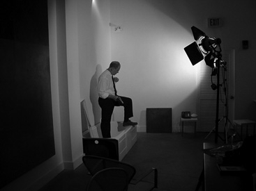
BATHTUB FUND: A philanthropic photographic project featuring a mix of subjects and a notable bath-taker's bath.
A BECKENHAM BOY: "A Beckenham Boy "
A Beckenham Boy
i.
Look left, look right the blackbirds take flight
The Green Howards are all in green
This is your victory. Blood, toil, tears, might
And God has saved your Queen
Come Sunday ride at Eastertide
The cherry trees hung all in bloom
Take your pride and luck in stride
One hangs high at noon
One hangs right, one hangs left
The cherry tree blossom is white
No one should hang for love and theft
But they hang you just for spite
ii.
On Easter day the children at play all around the mead
Plucked primroses there and they left them with care left them still sweet for dead
Down the road the boys did follow wherever the girls they lead
The meadow was green, the sun was yellow, and the sky was red indeed
The noonday Sun to air on high
Daffodils and palm are gathered to die
Under the midnight stars the poplars give sigh
To the yellow moon and the red sky
iii.
You never knew when you were young
Bostonians you live among
And if as a boy grows older
He leaves his sweetheart true
The one who gave her shoulder
The one he never knew
The fold long waits for you
Luck is chance and trouble sure
So hedge your bets and leave me poor
No muse will make you drunk with rhyme
Milton cannot do like wine
So dip into this copper kettle
And lie among the stinging nettle
iv.
England’s last great elm
Stands still upon your grounds
Passed by and by
By horsemen high
And their hunting hounds
v.
The laurels are cut took to fair
Though if God is in Gloucestershire
Then He is sure to see you there
The daffodil goes as the Lent lily went
The snow hung cherry bough low bent
Tells all that was allowed and spent
The whispered heaven-heard repent
Tells of the path of ill intent
That takes you back to Beckenham, Kent
— L.A. Nemrow
BIO.LOGUE: legacy publications preservations + productions under Un-Gyve Press.
BIS BIS: Bis Bis: rhymes with peace; what the Italians say for an encore; bis bis \bēs bēs\ escl: [Italian] again again, encore encore.
BITUMEN: A black viscous mixture of hydrocarbons obtained naturally or as a residue from petroleum distillation; sticky, black, highly viscous liquid or semi-solid present in most crude petroleums and in some natural deposits; a substance classed as a pitch; also known as asphalt; used for road surfacing and roofing. Dead Sea Bitumen, Judaicum Bitumen, its value documented since the third millennium B.C., was granted exclusively to Cleopatra by Marcus Antonius. Come to be called Bitumen of Judea by the 19th century in Europe the substance, that reacts to sunlight by hardening, served Joseph Nicéphore Niépce in creating the first metal heliographic plate, in 1826, used to create a reproduction print of the original 1633 etching of Le Cardinal d'Ambroise by Isaac Briot. In the same year Nicéphore Niépce pioneered the photographic process using a pewter plate coated with Bitumen of Judea and a further coat of light-sensitive silver salts to capture an image from his kitchen window at Le Gras (La cour du domaine du Gras), Saint-Loup-de-Varennes.
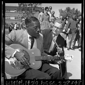
BLUES: "...the blues is just by itself — that’s the blues." — Son House.
BODONI: Giabattista Bodoni (February 16, 1740, Saluzzo, Piedmont - November 30, 1813, Parma) engraver, printer, publisher, punchcutter, and typographer, was born into an Italian printing family, hired by the Vatican printing house in Rome at the age of eighteen, and in 1768, he was appinted a lifetime position as Director of the Press of Ferdinand, Duke of Parma. Considered the father of the so-called "modern" typeface. Il Manuale tipografico, 1818, published posthumously in Parma by Bodoni's widow, chronicles his life's work with an extraordinary collection of typefaces in two volumes containing Asian, Greek, Gothic, Roman and Russian types; musical notation and numbers; borders, lines, and symbols.
BODONI: Typeface designed by Giambattista Bodoni in 1788 characterized by weight variations of thick strokes in contrast with fine thin strokes, unbracketed hairline serifs, and vertical stress. One of the four typefaces favored by Massimo Vignelli in The Vignelli Canon:
"The advent of the computer generated the phenomena called desktop publishing. This enabled anyone who could type the freedom of using any available typeface and do any kind of distortion. It was a disaster of mega proportions. A cultural pollution of incomparable dimension. As I said, at the time, if all people doing desktop publishing were doctors we would all be dead! Typefaces experienced an incredible explosion. The computer allowed anybody to design new typefaces and that became one of the biggest visual pollution of all times.
In order to draw attention to that issue I made an exhibition showing work that we had done over many years by using only four typefaces: Garamond, Bodoni, Century Expanded, and Helvetica. The aim of the exhibition was to show that a large variety of printed matter could be done with an economy of type with great results. In other words, is not the type but what you do with it that counts. The accent was on structure rather than type."
Well-leaded and with a generosity of white space the striking Romantic letters of the Bodoni, with clean lines and elegant geometry, though less fluent than ideal for full passages ("the most illegible type that was ever cut" charged William Morris), in their stately form, beckon the eye to take notice of title text. Still more to be said for disfluency and memorability of the message when the reader takes pause: Fortune favors the Bold (and the Italicized).
BOOTLEGGER: Rum-Runner.
BOSTON: the city.
BREAKING THE LINK:
by Katherine H. Smith and Nicholas Wilson
Katherine H. Smith is co-writing with her colleague Nicholas Wilson his compelling life story for Un-Gyve Press: of crime and punishment, of change of heart, of new life. She is a practicing therapist who is in the process of applying to law school. Her weekly advice column, “Between You and Me,” appears every Monday in The Epoch Times where she also contributes features for the Arts & Entertainment pages.
BUCZKOWSKA: Kasia Buczkowska is a writer and translator in New York City, who writes very short fiction in Polish and English. She has published her “short takes,” so named by Rosanna Warren, in Literary Imagination and in Przeglad Polski, the cultural supplement to Nowy Dziennik, in NYC, to which she also contributes articles and reviews. Her first book is a collection of such short takes — with a quality of foreignness to the voice that forms quirky folk-tales and vignettes, urban and pastoral, in Prose.
BURNETT: Archie Burnett, Professor of English and Co-director, Editorial Institute, Boston University, MA, English Language and Literature, University of Edinburgh, PhD, English Literature, University of Oxford is the editor of Selected Delanty for Un-Gyve Press. Born in Scotland in 1950 he studied at the University of Edinburgh before completing his DPhil at the University of Oxford in 1977, with a thesis on Milton's language. He was Junior Research Fellow of St John's College, Oxford 1974-8 then Lecturer and eventually Professor in English at Oxford Brookes University 1979-2000. His scholarly editions, Milton’s Style: The Shorter Poems, Paradise Regained, and Samson Agonistes (1981); The Poems of A. E. Housman (Oxford English Texts edition, 1997); The Letters of A. E. Housman (2 vols., 2007) the introduction to A Variorum Commentary on The Poems of John Milton, vol. 3, Samson Agonistes (2009); Philip Larkin: The Complete Poems (2012) have earned him high praise — "Burnett is the new gold standard." Classical Review — and he is "currently preparing a collected edition (so far, text only) of the prose of T. S. Eliot in 5 or 6 volumes" which is certain to raise the bar.
BURNS: Robert Burns, Lincluden Abbey. Views of the Haunts and Homes of the British Poets, Oct. 19 1850.
BUTLER: Samuel Butler, Ludlow Castle. Views of the Haunts and Homes of the British Poets, Oct. 19 1850.
BYRON: George Noel Byron, Annesley Hall. Views of the Haunts and Homes of the British Poets, Oct. 19 1850.
N.B. The alphabet swatch colour is Bowling Green from the Un-Gyve Palette.